CASE
DESIGN AND ARCHITECTURE NORWAY
DOGA
DOGA (Design and Architecture Norway) aims to facilitate learning and experimentation in Norwegian design and architecture. Through the development of a new brand platform and visual identity, Knowit Experience has helped DOGA showcase the industry, rather than itself.
Built around design methodology
DOGA had been formed through a merger of three independent organizations - and therefore needed to find a clear, new direction for the new entity. They wanted design methodology to be strategically and visually central to the process of creating a new platform.
Designers have been involved in the work from the start, with the development of brand platform and valuation, all the way through to the completed visual profile and logo. The entire process has ensured that the new identity is central to DOGA's new strategy, thus contributing to the organization reaching its goals as a single entity.
Creates an arena
DOGA – Design and Architecture Norway – advances the role of design and architecture in shaping Norway’s future. The organisation facilitates collaboration and creates an arena for practitioners and businesses in the sector.

In constant movement
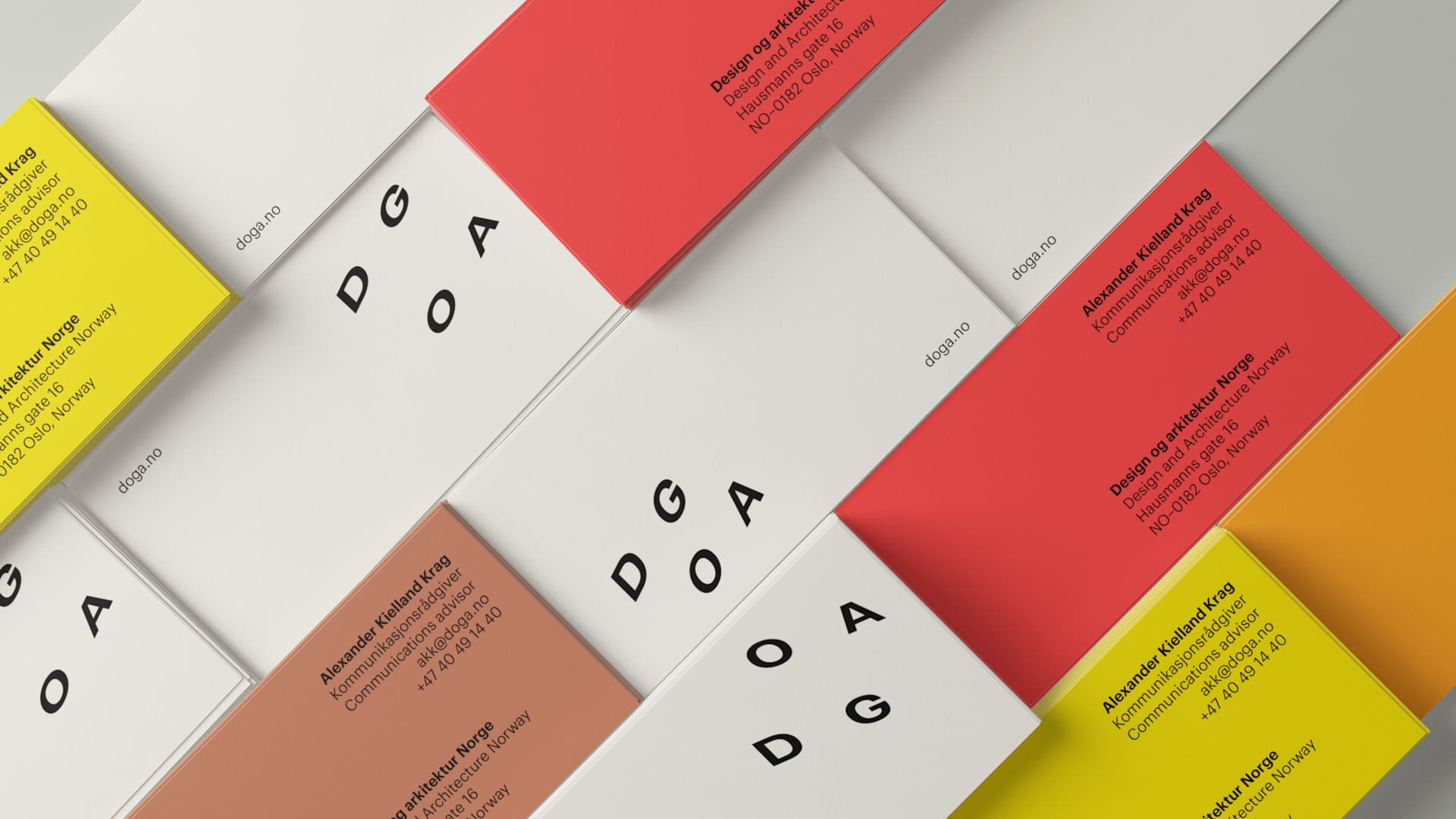
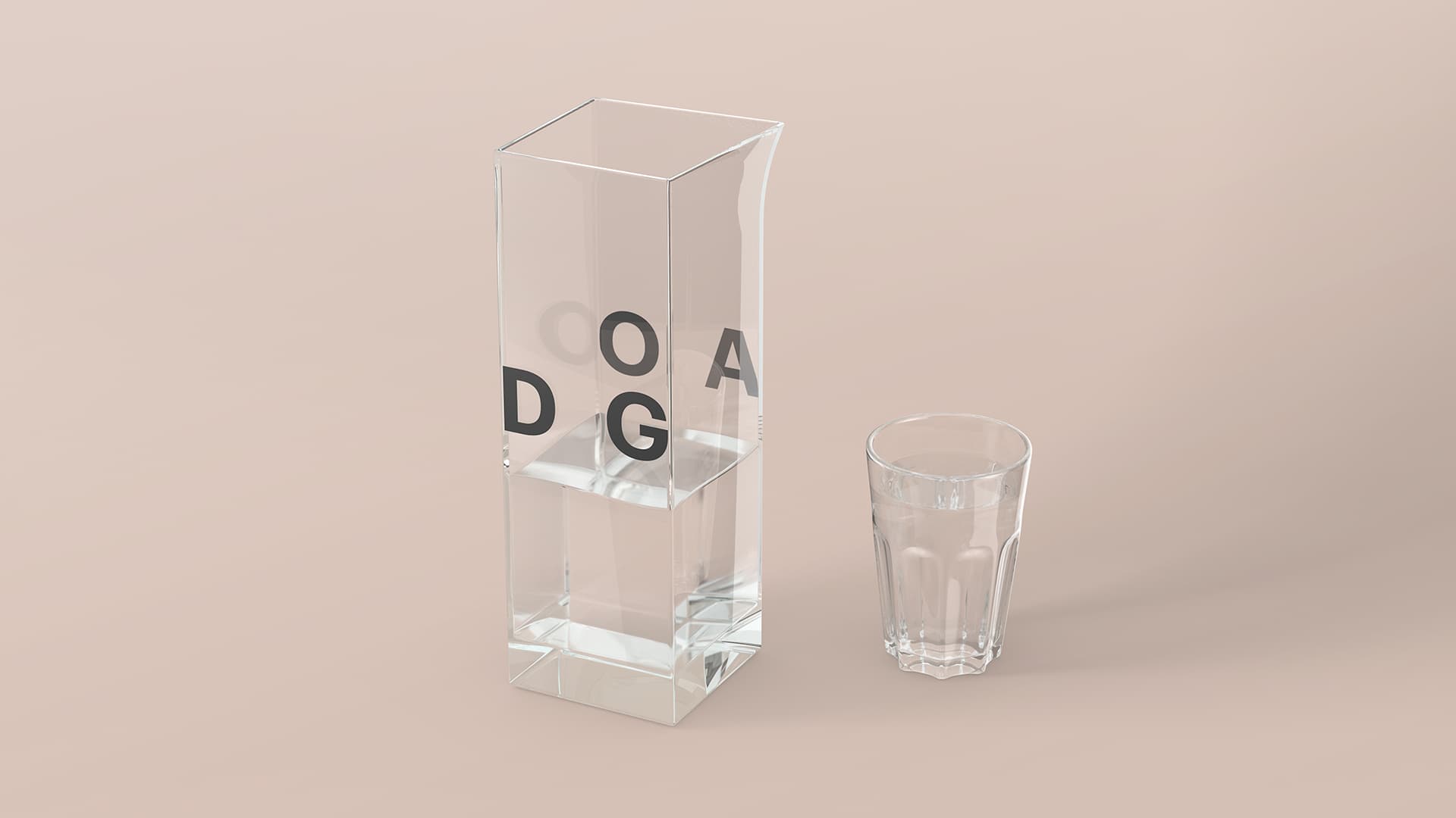
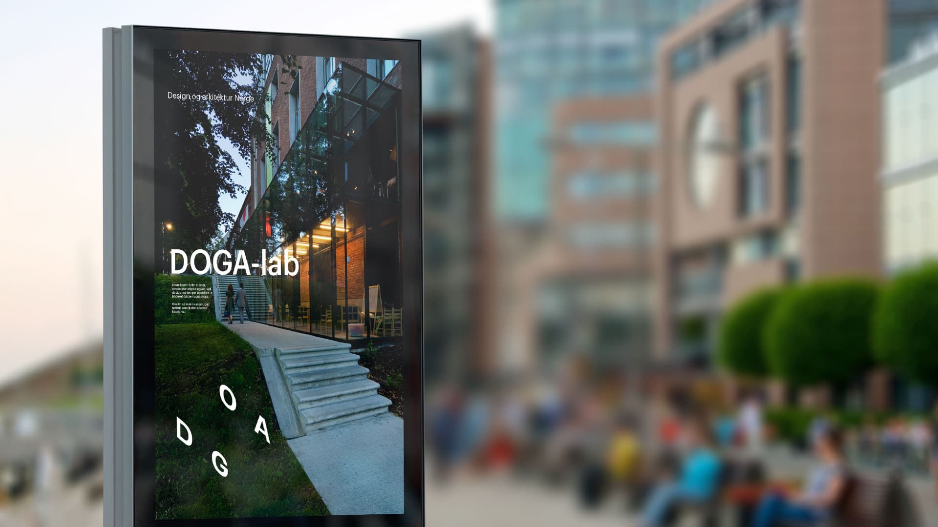
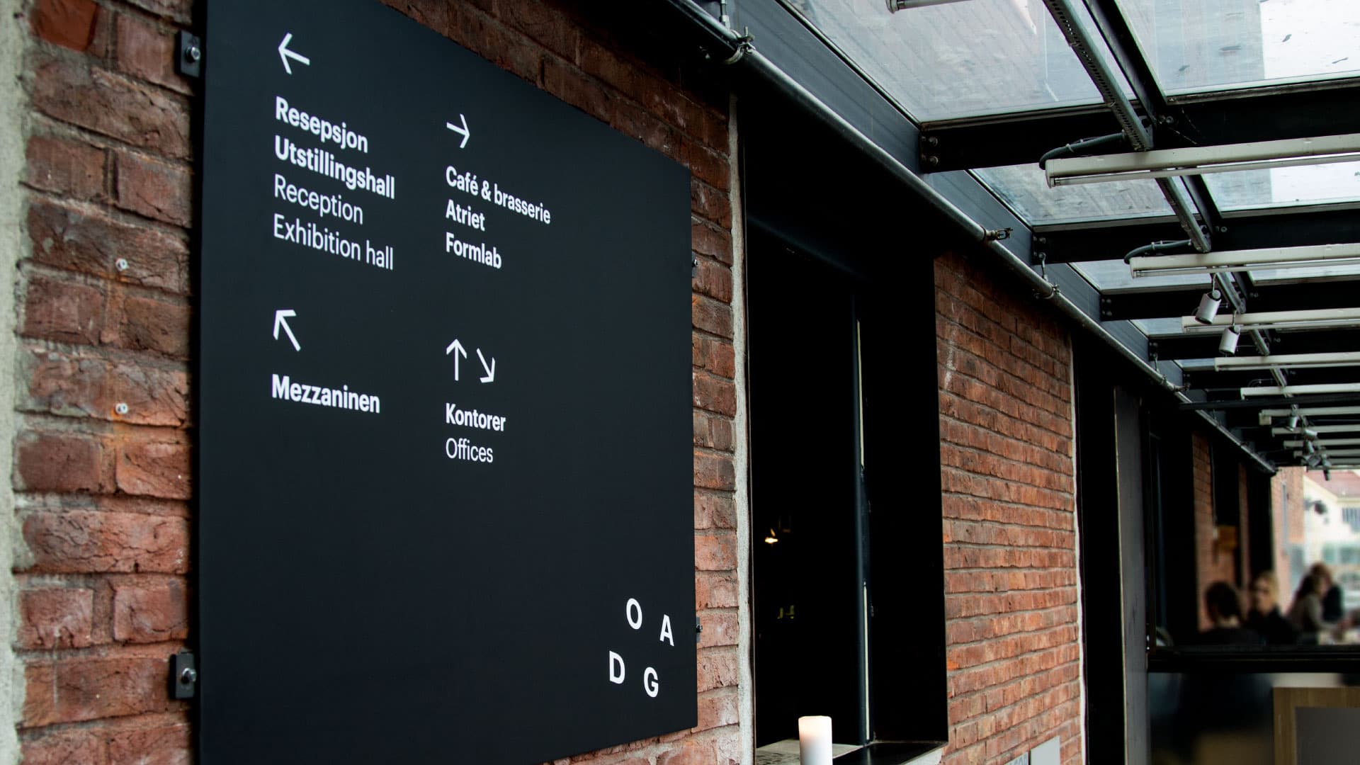
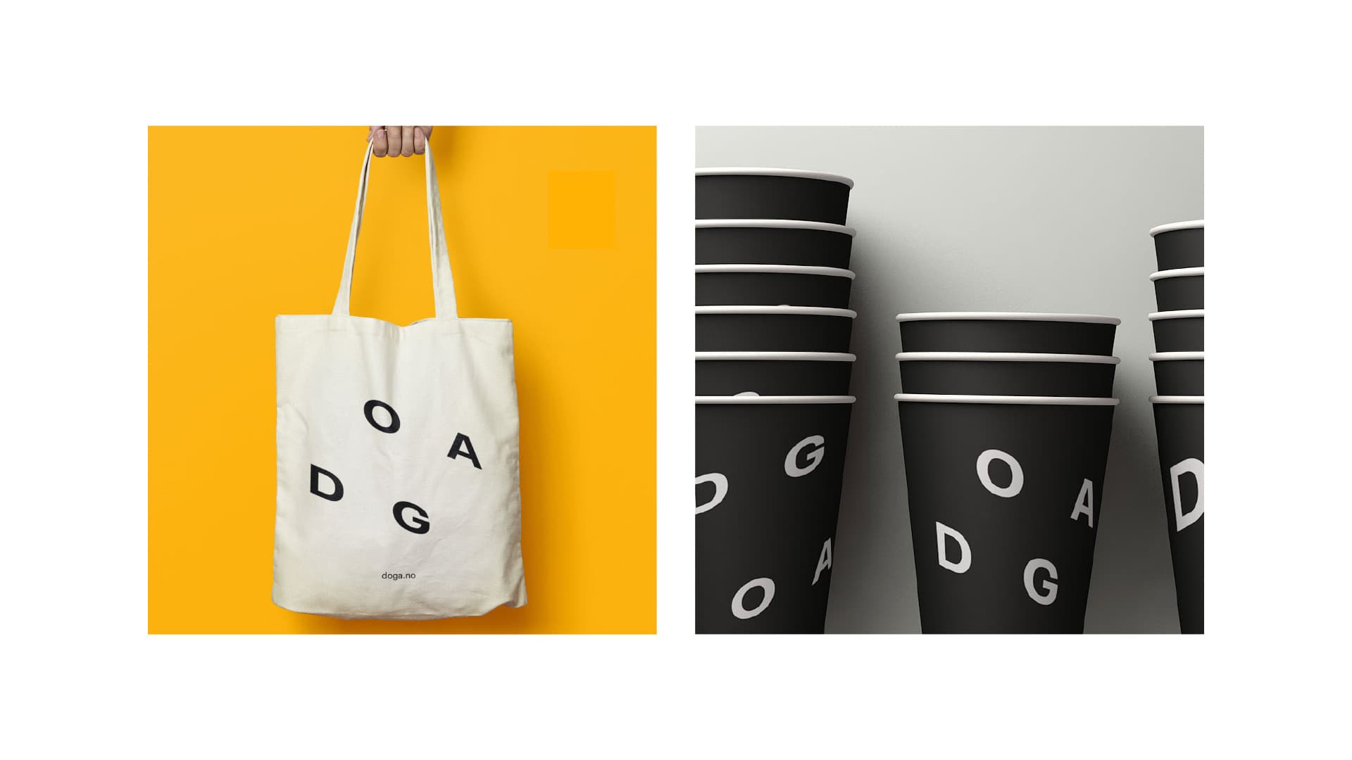
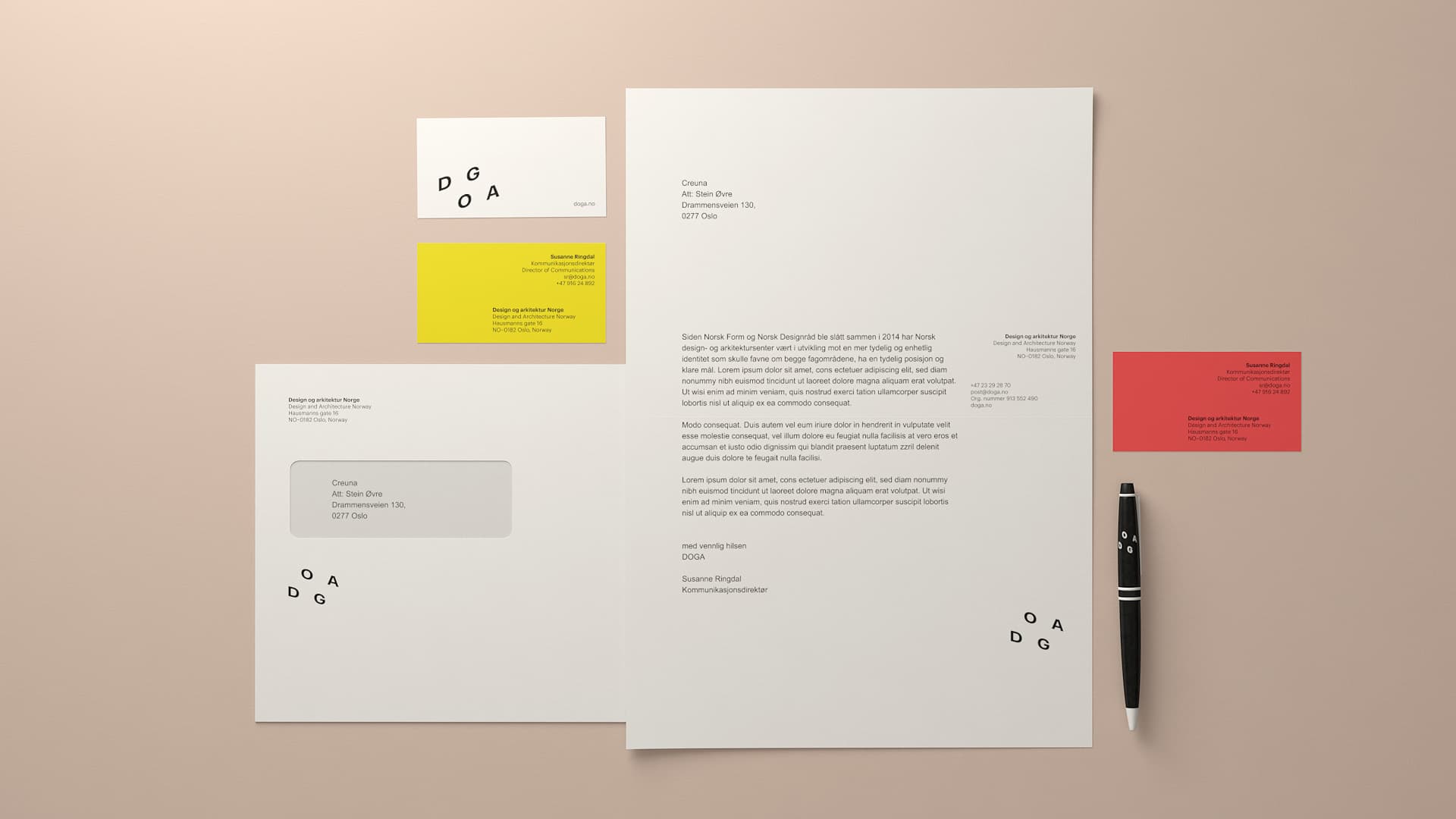
The highlight of DOGA’s brand profile is a new logo, featuring four letters displayed without a dominant focal point. The letters act as visual cornerstones, naturally creating shape and substance, depending on the point of view. The logo hints at DOGA’s ambition to be an arena for possibilities.
DOGA represents the various design and architecture disciplines, which are reflected in the way the logo comes to life. The logo adapts itself to digital formats – and where motion is possible, in 3D physical formats, and in 2D and printed materials.
Users can interact with the logo on the web, producing experiences that vary, depending on the type of device. A digital “logo maker” was also created, making it easier to design new logos in an infinite range of perspectives. As a result, the new visual identity appears organic and dynamic – quite appropriate for a sector in transformation.
Vil du vide, hvordan vi kan hjælpe dig?
Du er velkommen til at ringe eller sende en besked, så kontakter vi dig.

Mikkel Olesen
CCO
Knowit Experience